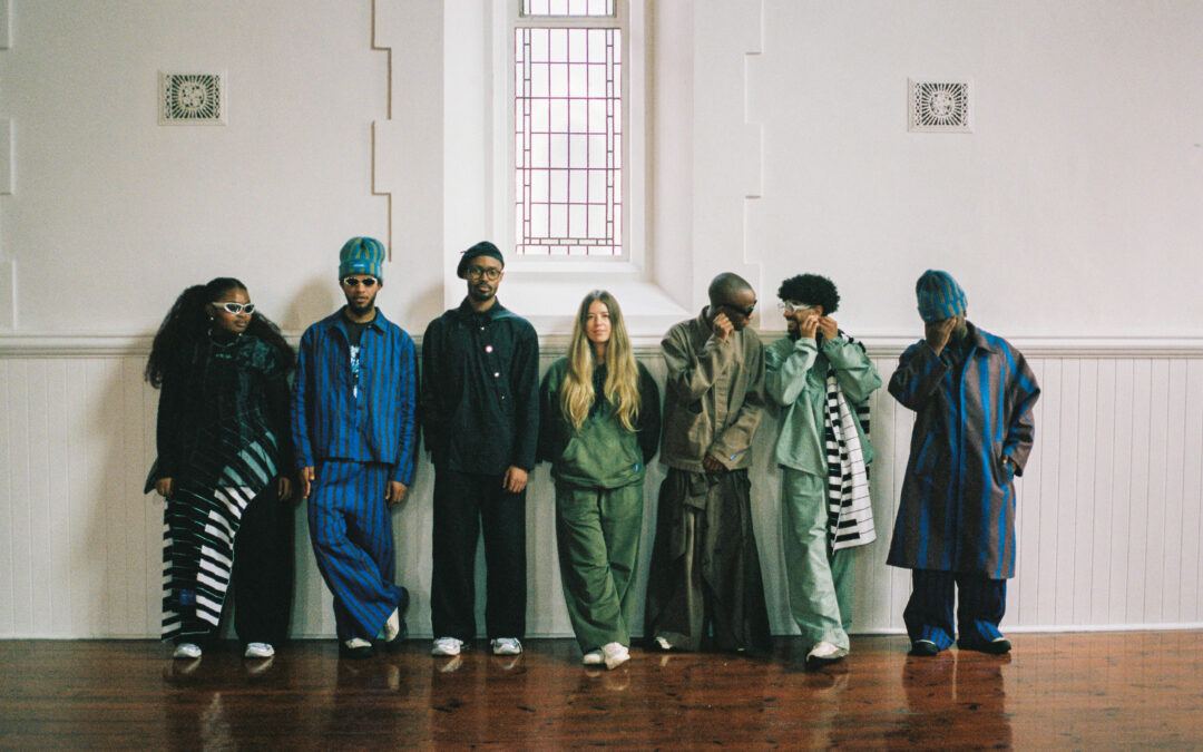
We love when an accidental series occurs. In 2022, I had a slightly hair-brained idea to merge together two aesthetic niches; the ugly beautiful cake trend and WGSN x COLORO Key Colours Forecast- you can read Volume 01 and Volume 02. Apparently, I am not alone in my immediate interpretation of colour through the lens of food; as these pieces continue to be some of our most read at CEC. So, I’m back, albeit with a slightly different lens; how food became fashionable.
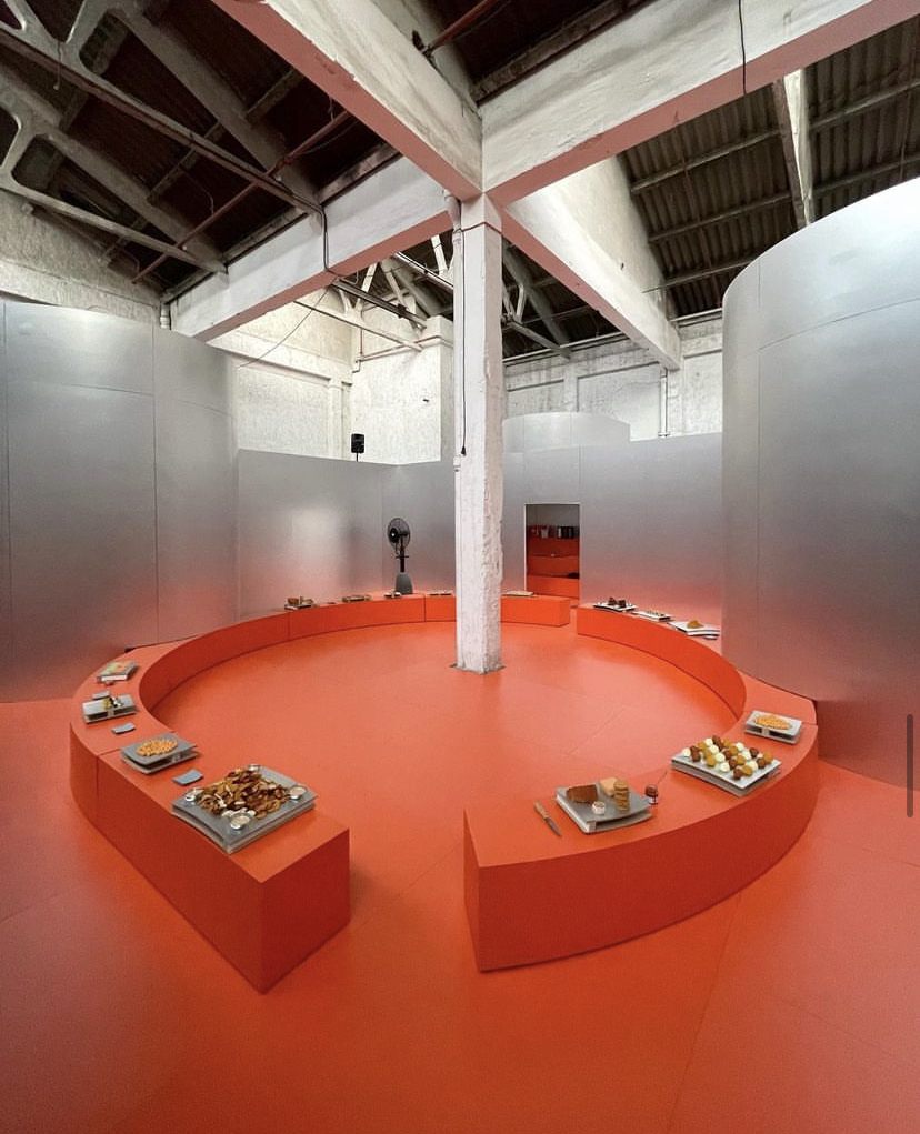
From local culinary studios like Studio H and John Joseph’s The Anatomy of Food – to international food design and creative spaces like GABFOODS, Cantine Laszlo, Tiberi Club, Casa Lawa and CENTÁ – the art of plating, catering and conceptual food design has left the kitchen of fine-dining restaurants and have become indisputable aspects of how brands and people seek to showcase their creative vision.
Last year, The Zoe Report stated that the most interesting ‘influencer’ group on the rise were the foodies. While this piece focuses on the work of culinary studios working in the art and fashion world, it’s interesting to note The Zoe Report’s comment that “the most current examples of food/fashion influencers don’t share one specific style; they’re bringing their individual culinary backgrounds and inspirations to the table as well as their uniquely cultivated aesthetics, which embraces an even bigger online trend: accessibility. Some found their way into this collision of content as a way to create a healthier relationship with food, while others grew up working in family restaurants or creating recipes as part of a cultural tradition. The common thread among this emerging group is the ability to make cooking and baking more approachable, but also to present food as an artful and stylish form of expression — something to consider as thoughtfully as you might a favourite ensemble.”
The relationship between food and fashion from a design perspective is an interesting, interdisciplinary exploration that involves the visual and sensory aspects of both spaces. Whether its GABFOODS developing culinary offerings for Loewe or Tiberi Club’s showcase for Barcelona Design Week, creatives working in either food or fashion are wholly invested in the sensorial features of their work; whether felt on the skin with fabrics, or felt in the mouth of our palates. When curating aesthetic visions and embodying principles of design, the blurring of distinction between fashion, food, design and art invites us to dream up worlds in which beauty and play are at the forefront of the creative process.
WGSN x COLORO ‘Color of the Year; brings together the trend forecasting proficiency of WGSN with Coloro, the global colour system that offers both physical and digital solutions to guarantee precise colour representation – and the key colours, released last October for A/W 25/26, are Celestial Yellow, Cherry Lacquer, Retro Blue, Neon Flare and Future Dusk, as released here.
Celestial Yellow- 048-90-17
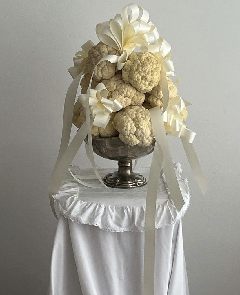
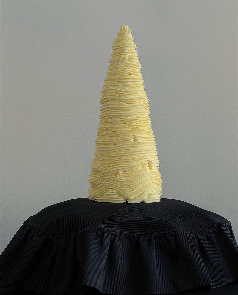
“Celestial Yellow is a glowing, luminous, multi-sensorial colour that feels both restorative and surreally off-kilter. It is reminiscent of the moon, the stars and the sun, and connects with the search for reassurance and guidance as people look to spirituality, astrology and astronomy in times of uncertainty.” This buttery yellow hue is best conveyed in the fashion-food realm by towers of whipped butter, such as the Christmas tree by Lisbon-based studio CENTÁ. Their signature bow application is already iconic – and yes, you guessed right, they have collaborated with the Bow Queen, Sandy Liang, for her wedding, no less!
Celestial Yellow – 048-90-17, via WGSN and COLORO.
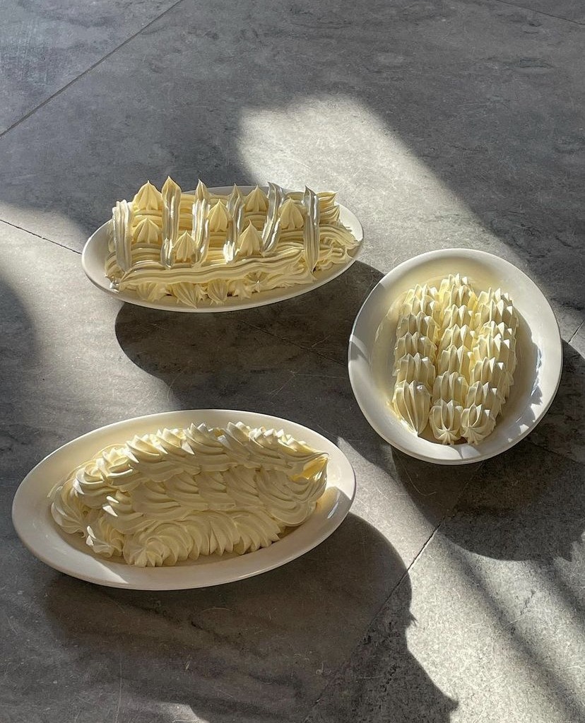
Mateusz Ulman’s Butter, via @p.l.a.t.a.b.l.e IG
CENTÁ, Butter Christmas Tree, via @centa_project IG
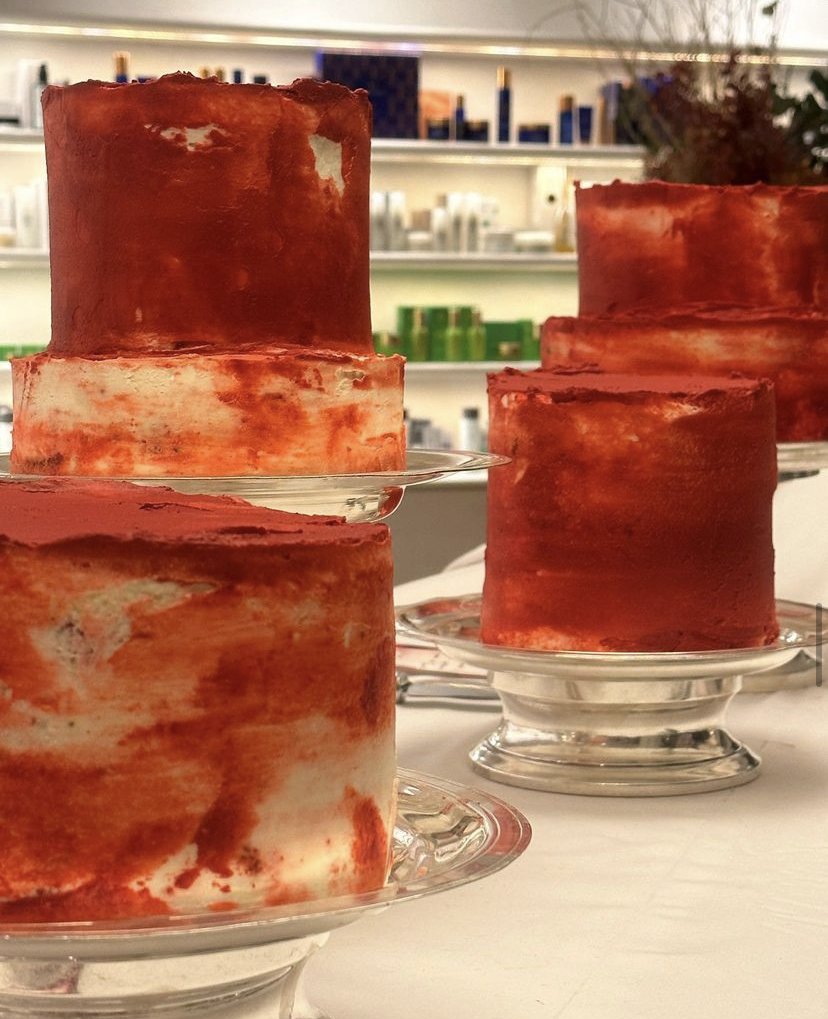
Cherry Lacquer- 159-23-15
“Cherry Lacquer is a subversive dark with a luxurious appeal. In the age of rage and uncertainty, Cherry Lacquer feeds into themes of resistance and rebellion. It also has a seductive quality that taps into our deepest desires, taboos and pleasures as a form of radical escapism and self-empowerment.” Cherry might have been the obvious parallel here, however; the humble chicory variety, radicchio, deserves its time in the sun. Whether it’s Casa Lawa crudités or Cantine Laszlo’s ‘vegetable bouquets’, the purple, crimson leaves of radicchio are the perfect ambassadors for Cherry Lacquer.

Cherry Lacquer – 159-23-15 via WGSN and COLORO
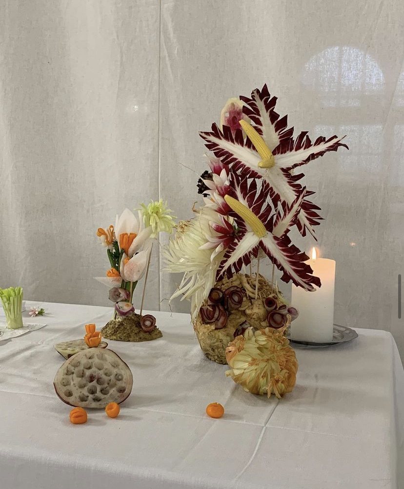

Casa Lawa, crudités for Opera Festival, via @casa.lawa IG
Retro Blue- 100-64-14
“Retro Blue is an offbeat, analogue colour with a warm and sentimental quality. It has an undercurrent of soft joy and innocence brought on by memories, aligning with the rise of kidults and nostalgic sentiments reimagined among Gen Z.” GABFOODS are a Spanish creative, culinary studio and a firm favourite of brands like Loewe and Marni, to bring a sensory layer to activations and launches. Note, their retro-blue Ongiri for Marni, or the blueish curation for Loewe’s takeover of Rosewood Villa Magna, in Madrid.
Retro Blue- 100-64-14 via WGSN and COLORO
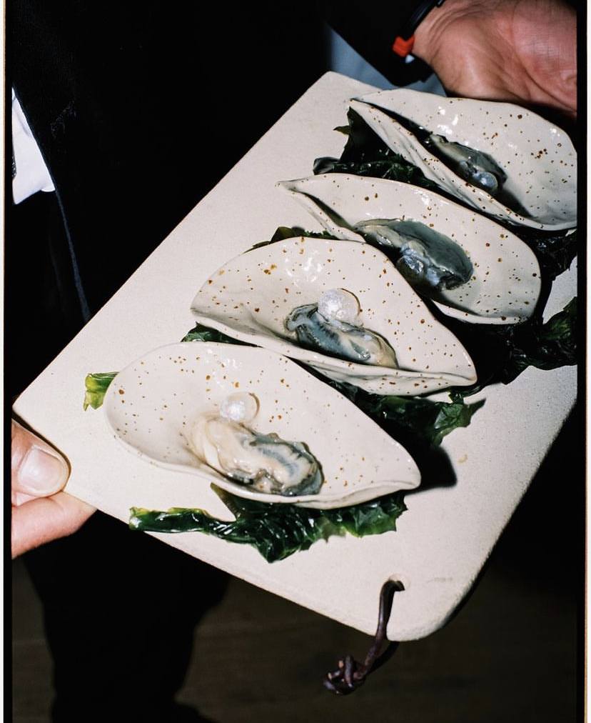

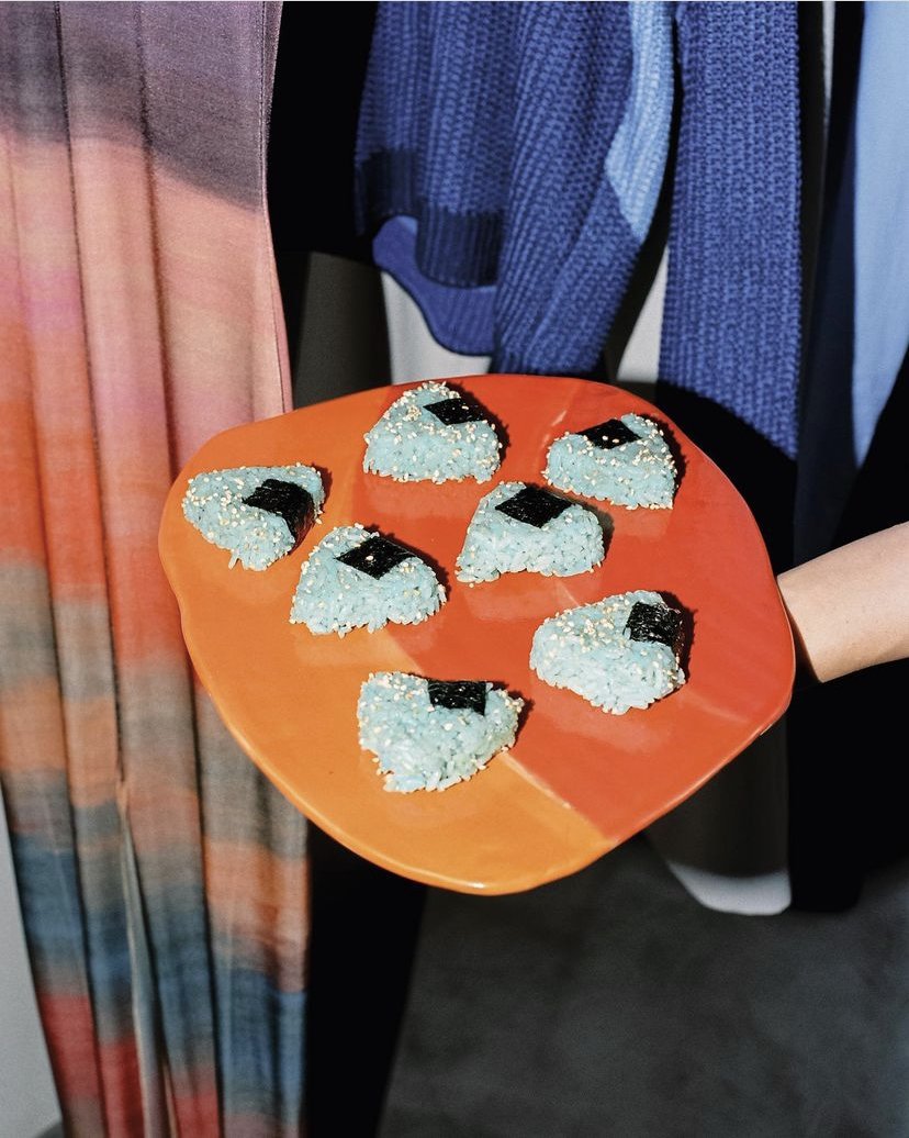
GABFOODS for Marni, & GABFOODS for Loewe’s takeover at Rosewood Villa Magna, via @gabfoods IG
Neon Flare- 014-68-51
“Neon Flare is a transient neon with a kinetic and synthetic quality. As the planet faces code red and climate anxiety becomes more pervasive, this AI-inspired colour has an igniting and stimulating effect, fuelling a sense of collective urgency as we strive to unlock solutions to ‘wicked problems’ (those with interdependent factors, which seem impossible to solve). Its charged character speaks to the need to come together and restore our spirits in a burst of communal effort and energy.” Though synthetic it may seem, Neon Flare instantly reminds me of one the greatest (albeit retro) cocktails; the grenadine-laden Shirley Temple. This hue can be seen by Cantine Laszlo’s custom cakes for the brand VIOLETTE’S lipstick launch, or Tiberi Club’s astounding installation for Barcelona Design Week.

Neon Flare- 014-68-51 via WGSN and COLORO
Heat Wave, pica pica by Tiberi Club for Formica Group Europe, Elisava and Barcelona Design Week via, @tiberi.club
The infamous Shirley Temple, a Neon-Flare icon, via @shakedrinkrpt
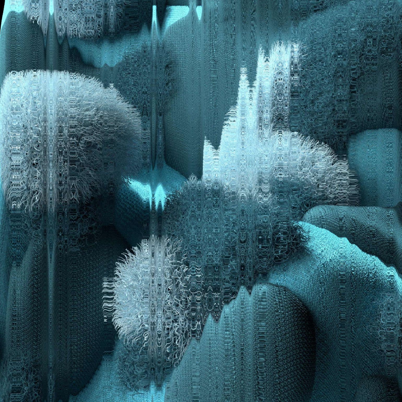
Colour of the Year – Future Dusk- 129-35-18
“This will be a year of strategic imagination, when individual and collective creativity will be harnessed to generate new economic and ecological solutions. Future Dusk aligns with this theme, sitting between blue and purple, and bringing a sense of mystery and escapism through its dark and moody qualities.This surreal and otherworldly shade also has a celestial and futuristic character inspired by the emergence of the second space age. It aligns with themes of moving from darkness to light, dusk to dawn, preparing us for new horizons.” Who better to embody Future Dusk’s ominous yet deep hue, than Thalia Ho’s rich array of confectionery? As the author of ‘Wild Sweetness’, Thalia’s commitment to injecting violet across her recipes perfectly marks the age of ‘Future Dusk’.
Colour of the Year – Future Dusk- 129-35-18 via WGSN and COLORO
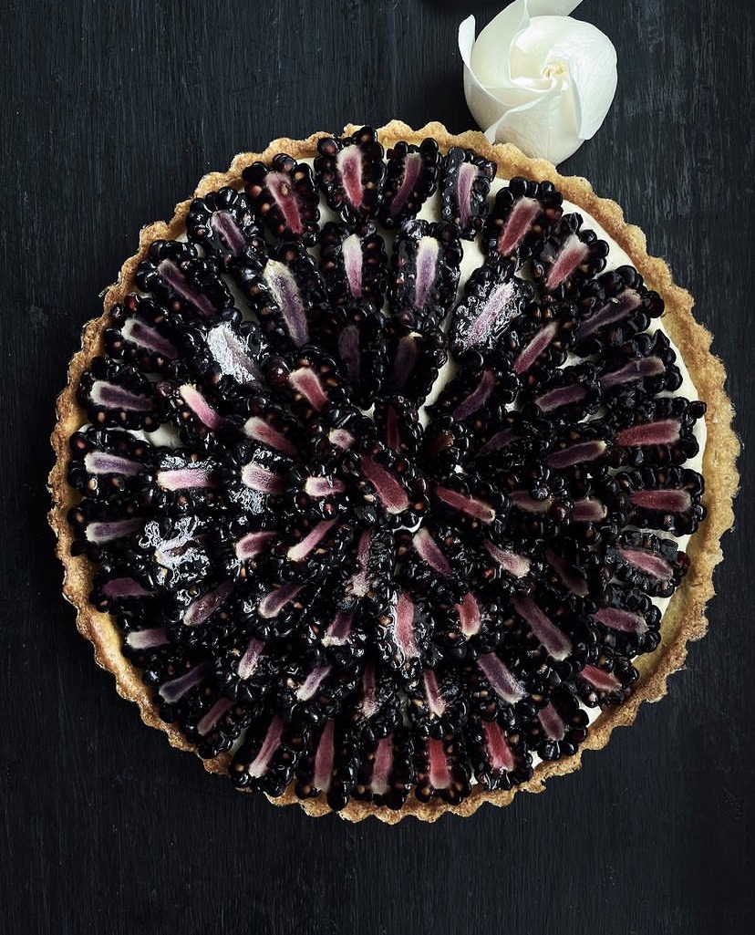

Thalia Ho’s blackberry and almond custard tart & blueberry preserves, via @thaliaho
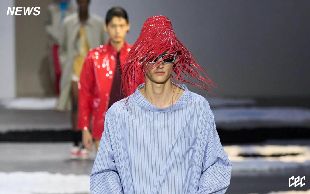
Written by: Holly Beaton