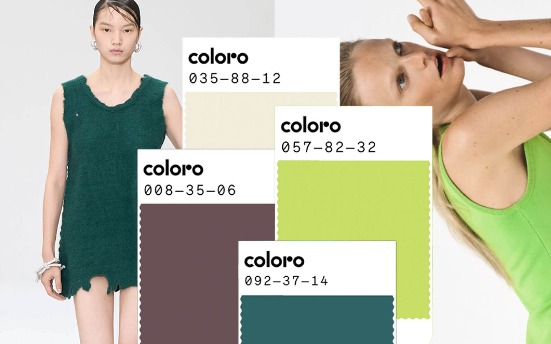
As is CEC tradition, we love peeking at the crystal ball of trend forecasting; particularly those offered by the WGSN and Coloro’s dynamic partnership and their cyclical colour palette predictions. As the A/W 26/27 season approaches, there is a focus on redirection and challenging old ideas will influence how we engage with colours in our wardrobes and interiors. These hues, selected by WGSN and Coloro experts, reflect this era’s defining themes: opportunity, polarisation, stability, and restoration. Our world is a surreal place, and this time in human history — tempered by technological advancements — should bring us no less than colours that exemplify the strange circumstances of our lives as human beings, on planet earth.
Here’s a guide to incorporating the five key colours – Transformative Teal, Wax Paper, Fresh Purple, Cocoa Powder, and Green Glow – into your wardrobe and living spaces, so you can be miles ahead and live in 2026, before it’s even 2025.
Transformative Teal’s Stable Fluidity
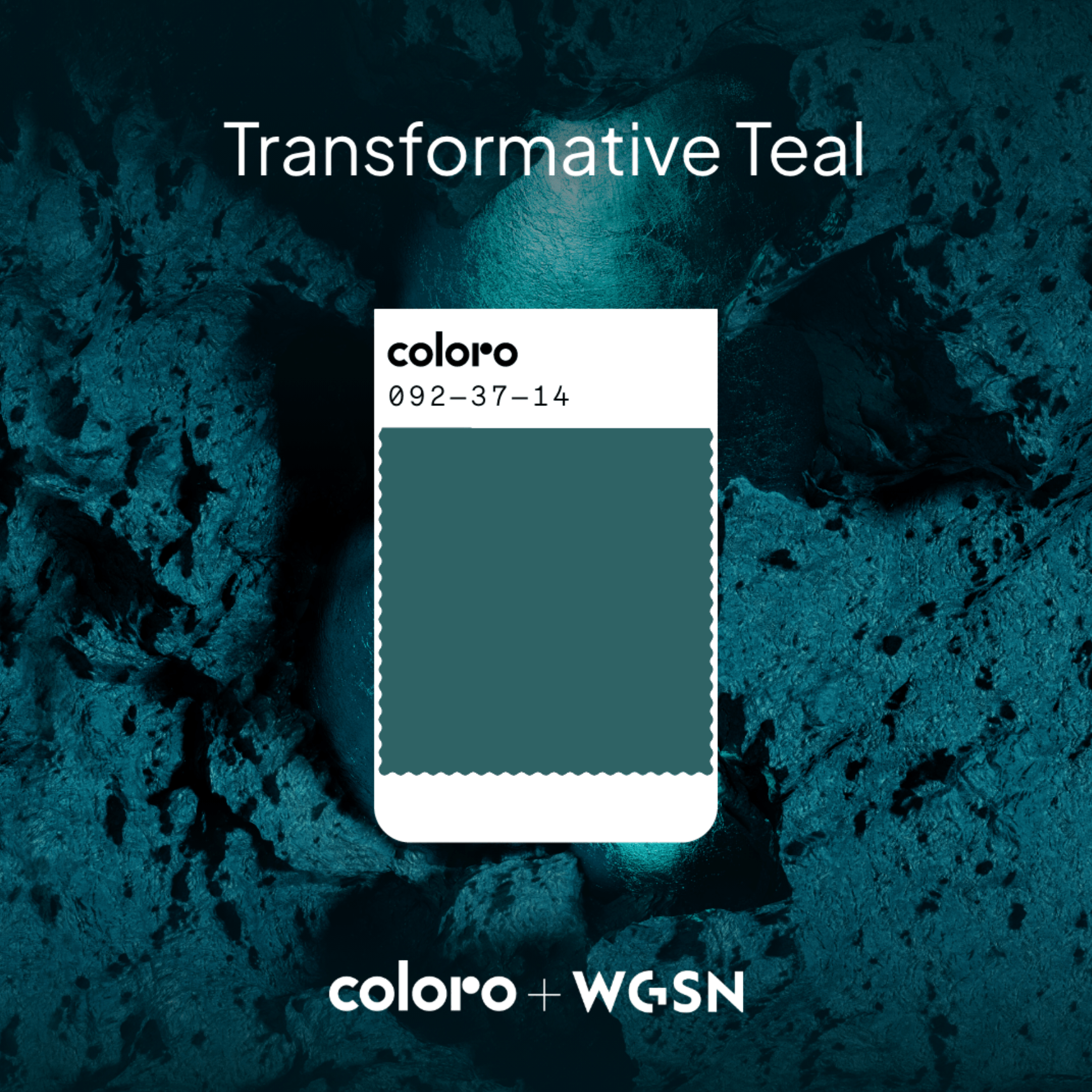
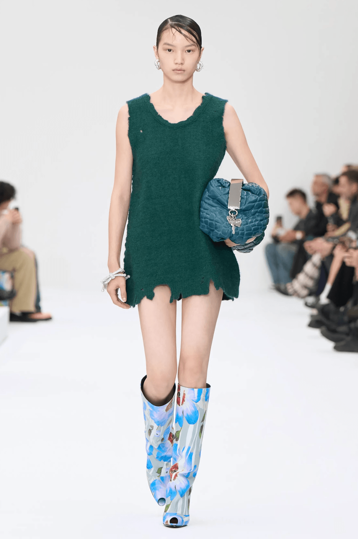
Wardrobe /// Transformative Teal is a blend of classic dark blue and aqua green, with a versatile hue that sweeps across gender-inclusive and transitional fashion. Use it as an alternative dark hue for utility pieces like tailored trousers or structured outerwear. Yes, we live in a time in which teal can actually function as a neutral. For occasion wear, Transformative Teal’s rich tone evokes the energy of jewels; find ways to bring it out in accessories, or simply opt for that wildly bold, teal tone garment that you’ve been afraid to wear until now. The forecasting Gods have given their permission.
Living Space /// In your living spaces, Transformative Teal works as a grounding and enriching base. Paint an accent wall in this hue to create a focal point, or use it in upholstery for sofas and armchairs. Teal, like its trend predecessor emerald green, pairs incredibly well with metallic accents like brass or copper that highlight its depth. She’s got range, so combining teal with natural materials like rattan and wood also works for a more balanced look. For a more playful and less permanent approach, incorporate Transformative Teal through smaller decor items such as cushions, rugs, or ceramics. We are all about non-committal participation when it comes to colour trends.
TRANSFORMATIVE TEAL by WGSN x Coloro, via wgsn
‘Transformative Teal’ showcased by Acne Studios SS25, via gorunway
Wax Paper’s Subtle Contemplation
Wardrobe /// Wax Paper’s creamy yellow and off-white tones lend themselves to a soothing, near-neutral palette. This shade is ideal for layering basics, and its warmth pairs beautifully with other neutrals such as beige, taupe, or grey; we love a monochrome moment, for is there anything more chic than the absence of colour?
Living Space /// Wax Paper brings a sense of calm to interiors, making it perfect for spaces dedicated to relaxation. Use it for bedding, curtains, or area rugs to create a serene bedroom or living room. This shade also works well in kitchens or bathrooms, in which its soft glow can mimic natural light. Enhance its warmth with subtle lighting, like soft yellow LED strips or vintage-inspired bulbs. Seriously, if you’re not lighting your home with anything but soft yellowing light — I don’t know what to say to you. I am highly and extremely harsh lighting adverse, and you should be too.
Fresh Purple’s Bold, Phygital Energy
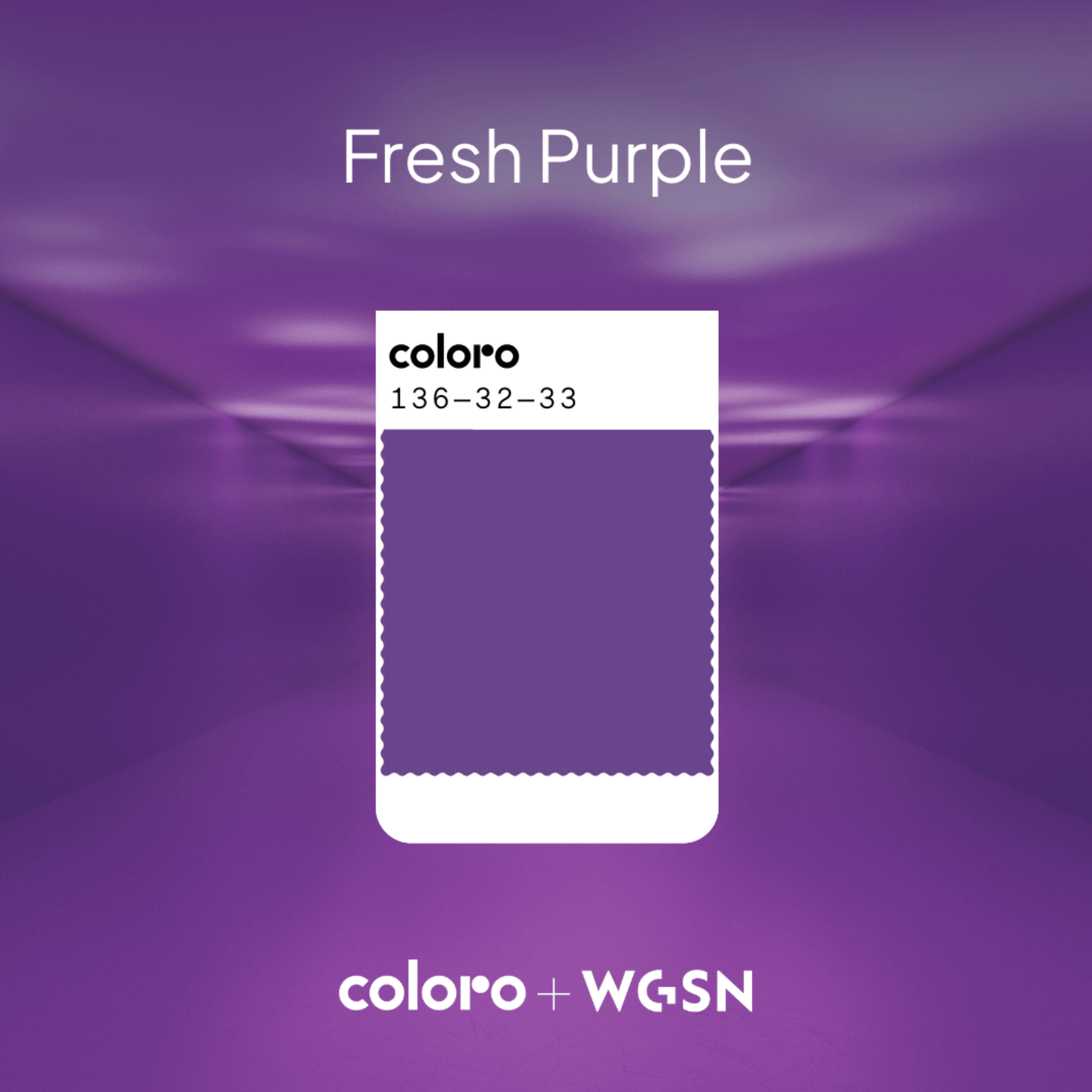
Wardrobe /// Fresh Purple’s royal presence is interesting — given that purple has taken a back seat for the last few years. We can now give full Prince energy with bold suits, or activewear sets that harness this colour’s energy. As an accent, Fresh Purple injects a dose of joie de vivre into any outfit.
Living Space /// Use Fresh Purple sparingly to avoid overwhelming a space, opting for decorative pieces such as vases, artwork, or throw pillows. Its glossy finish adds a playful touch to home decor, while its connection to creativity and spirituality can make it an intentional choice for personal spaces such as home offices or studios.
‘Fresh Purple’ exemplified by Bluemarble SS25, photographed by Umberto Fratini, via gorunway.com BlueMarble
FRESH PURPLE by WGSN x Coloro, via wgsn
Cocoa Powder’s Nostalgic Warmth
Wardrobe /// I have never been more ready for brown’s revival in our cultural colour palette. Cocoa Powder’s red-toned brown is such a classic and incorporates this hue into pieces like trench coats, shoes or better yet —the whole damn look. Be not afraid of monochrom-ing brown, in all its shades. Its warmth complements a wide range of colours, from neutral tones like cream and tan to brighter shades like ochre or burgundy.
Living Space /// Cocoa Powder evokes a sense of nostalgia and grounding. Use it for larger furniture pieces, such as wooden dining tables, leather sofas, or bookshelves. I have recently made sure our bedroom cupboards ooze this creamy, warm shade; oh-so soothing for your sanctuary. Cocoa Powder pairs beautifully with earthy materials like terracotta, linen, or wood, and considers metallic finishes or glass elements that contrast with Cocoa Powder’s organic feel. Is anyone else also completely besotted with stainless steel as a material, in any size or shape?
Green Glow’s Hypnotic Brightness
Wardrobe /// Green Glow is a high-energy, responsive bright that adds a wild pop of colour to any outfit. Use it for bulky statement pieces like puffer jackets or raincoats, and you best believe we are going to see this colour pop up in its rightful space; in the sneaker realm. If anything can tell us just how cyclical trends are it’s the return of neon, which most of us millennials thought would never see the light of day again. Then again, this is probably how exactly people felt after the 80s.
Living Space /// Green Glow could bring a futuristic and electrifying edge to interiors, but be gentle and non-committal in your approach. Use it sparingly for maximum impact; think neon signs, LED strip lighting, or small decor items like photo frames or cute desk accessories. This colour is especially effective in spaces designed for creative pursuits, such as home or creative studios. CEC has been known to inject a note of neon, too; we’re eclectic and cute like that.
As always, our disclaimer in reporting on trends is such; these are but mere guides that demonstrate how our world can be distilled into a few colours, intended as a compass that helps us tap into our collective mood. Use it, don’t use it — we think it’s pretty cool that our world is as colourful as it is, and that human beings are like little moths for this ever-changing kaleidoscopic experience of life.
Written by: Holly Beaton
For more news, visit the Connect Everything Collective homepage www.ceconline.co.za

