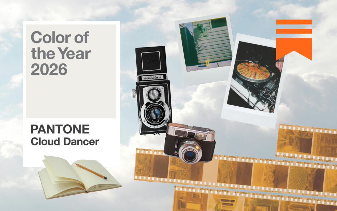
I have often wondered when, in the midst of this technocratic and contemporary world, we might approach a total abandon or rejection of the hyper-curated – particularly when all we want and all we consume, tends to arise by an eerie and mesmerising order of design. I feel this way about WGSN – the behemothic trend-forecasting institution – whose guarded and prized secrets are hidden behind a stringent paywall; trading in information that is invaluable and highly analysed from market, to brand and finally to us, the consumer. The open-source information that WGSN does share – like their podcast, Create Tomorrow, are bite-sized, interesting conversations with leading innovators in design, beauty, fashion and tech; as a resource for a changing world, changing consumers, and building better products. There is an aspirational feeling, indeed, when I listen to their work – all futuristic and streamlined realities abound, and then a sense of relative excitement when their bi-annual colour forecasting drops in partnership with Coloro. In our first edition of ‘Collating Colour with Confectionary’, released early last year in 2022, I wrote, ‘The other half of this collaboration, Coloro, is a company created to build colour systems for the creative industries; combining research based in the logical application and intuitive envisioning of colour as it pertains to brands, communication and design. Perhaps the most fundamental experience we have as human beings is the interaction of our visual cortex with refracted light, and such colour is an immensely powerful tool. It is the subconscious compass with which we approach our lives – emotional, mentally, physically and even spiritually. In explaining their system, the Coloro website states; “Coloro is based on a 3D model where every colour is specified by a 7-digit code. This code represents a point where Hue, Lightness and Chroma intersect. The system is built by a 160-step Hue wheel with a vertical axis of 100 Lightness values and a radial range of 100 Chroma values. Together, they create a new model to define human colour perception for a potential 1.6 million colours. The only limit is your imagination.’’
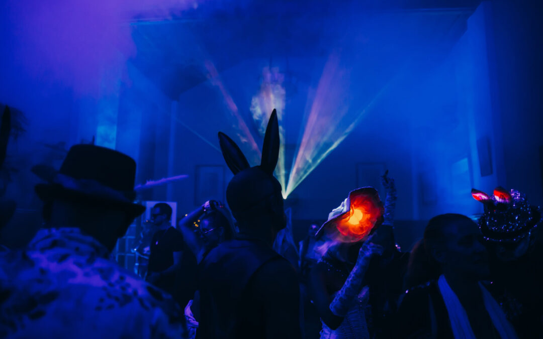
So why return to the AW 24/25 forecasting, and use the ugly-beautiful-cakes as a reference, once again? Within these neatly deterministic ways of understanding human behaviour and consumer psychology – when certainty is perhaps the most valued prize for understanding our culture/s – so too, are we experiencing a rejection of hyper-filtered aestheticism. In between beautiful packaging or aspirational moodboards – the Instagram ‘photo dump’ has seen users subvert the curated social media platform from serious, to almost satirical – and when fashion influencers like Clara Perlmutter AKA tinyjewishgirl lean into absurdist abandon in expression of personal style, we know we are collectively experiencing a reckoning with the concept of beauty itself; in all its forms. As Bee Beardsworth writes in her piece for Dazed, ‘In defence of bad beauty’, “Bad beauty is no longer solely concerned with defying conventionality and restrictions. Bad beauty is about inhabiting a new sphere of expression that extends beyond the limits of binaries and societal constructs. It’s about visceral honesty and commanding the power that comes from total ownership of personal narrative and creative vision.” In taking the very tools laid before us, intended for us to be more beautiful – more desirable – more tasteful, and more palatable; make-up becomes strange and surreal, pulling looks becomes a performance of autonomy and healing – and baking cakes becomes a canvas upon which the tension of this entire clash between hyper-aestheticism and human imagination takes place. The more AI-generated filters are introduced, the more there will be the inevitable resistance; protest in the form of doing, expressing and being precisely in the way that feels true.
_0")

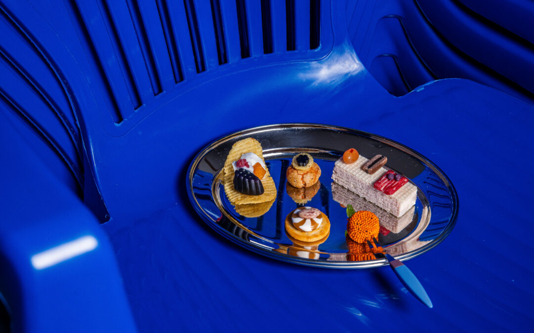
Subversive cakes hold the spectrum of colours, florals and adornment – albeit oozing and engorged (and not-unlike the artifice of consumption culture itself, and in the name of indulgence, this style of confectionary puts cake makers like Berlin-based Rust Cakes, Brooke Cowitz of Cry Baby Cakes, NYC-based Cake4Sport, Food Bebo, and Made By Nez as arbiters of the femme-led culinary wave taking root across the world. In the juxtaposition between their work and the ascribed ‘meaning’ of each colour for AW24/25, I hope you find the comedic tension of being real in an often unreal society.
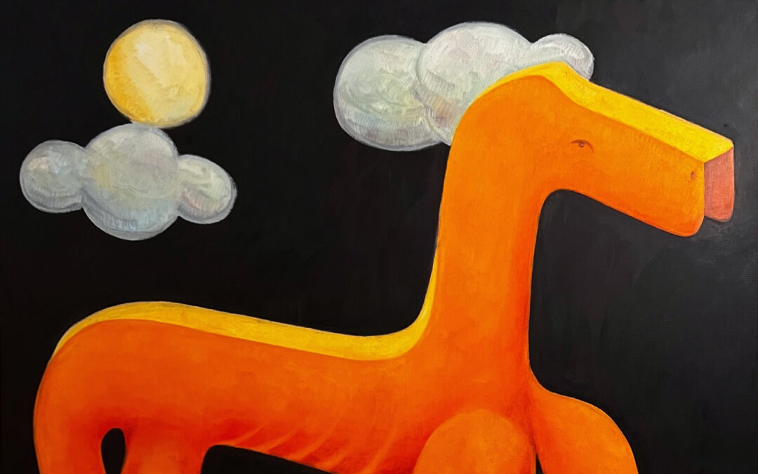
Intense Rust /// 015-33-25
“First forecast for A/W 23/24, Intense Rust returns to the palette for A/W 24/25 as a key colour. The warm and rich shade of Intense Rust is a trans-seasonal brown that evokes feelings of stability. Balancing luxury with a raw, earthy edge, this colour is reminiscent of soil, full of warmth and calm textures. It’s inspired by consumers increasingly valuing sustainability over newness, re-sale culture and products with long-term appeal. This colour communicates authenticity, quiet luxury and promotes a return of classic design.”


Midnight Plum /// 151-22-09
“Midnight Plum is a powerful dark purple that connects to themes of space exploration and the metaverse. NASA’s James Webb Telescope images opened up the possibility to unravel mysteries about the origins of the universe, allowing colours in space to capture our imaginations. A tinted dark close to black, this colour celebrates darkness, connecting to a sense of mystery as well as gothic and underground sentiments. It aligns with the increasing consumer desire for escapism.”


")
Sustained Grey /// 035-73-04
“Sustained Grey confirms the continuing importance of neutrals and more sustainable colour choices, which celebrates recyclability and the pursuit of ‘just enough’. Representing practicality and reliability, this colour is foundational and grounding with a utilitarian edge. It speaks to promoting balance and slowing down, as a timeless shade with trans-seasonal and long-term appeal.”


Cool Matcha /// 055-85-20
“Cool Matcha is a tinted pastel with a soothing and calm quality. Connecting both nature and technology, it highlights the importance of developments in nature-powered bio and plant-based materials, dyes, pigments and energy sources. As consumers continue to deal with feelings of anxiety and stress, we look to colour to help soothe the mind and bring a sense of rest and reflection. Cool Matcha is a quiet, pacifying pale with a therapeutic quality and is the perfect combination of a vegetal green and mindful pastel.”


Apricot Crush /// 024-65-27
“This balancing bright is an activating vitamin tone that embodies a full spectrum approach to health and wellbeing. Encompassing the natural vitamin- and antioxidant-rich benefits of apricots and oranges, it also draws from the beauty found in nature. Through times of so much uncertainty, Apricot Crush continues to confirm its importance, acting as a colour full of hope and positivity.“