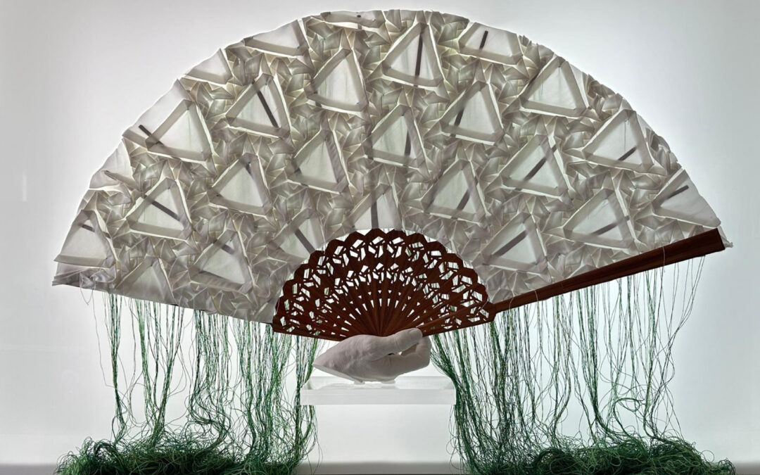
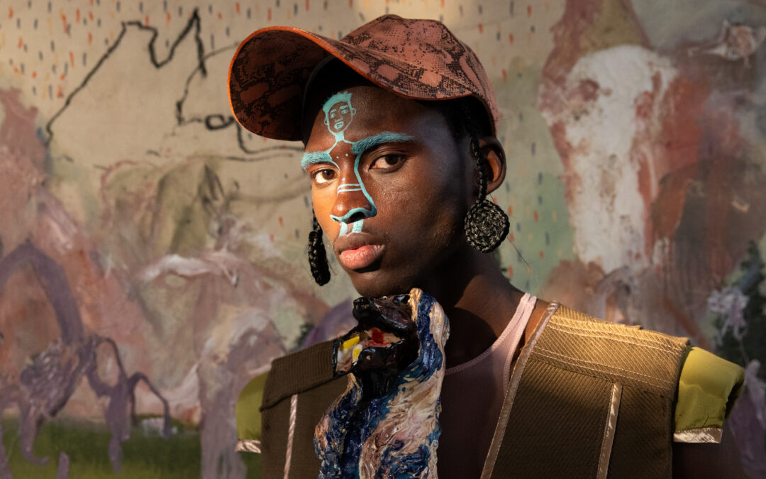
In collaboration with Coloro, WGSN brings us “A Window to The Future of Colour”, showcasing the key colours predicted for the SS24 season and beyond, developed around the themes of care, connection and community. At Connect Everything Collective, we have elected to interpret the brilliant shades of Cyber Lime, Radiant Red, Elemental Blue, Fondant Pink and Nutshell through the lens of one of our favourite current trends: the beautifully bizarre and decadent art-cake genre sweeping the confectionary world from Berlin to Toronto. Reminiscent of Sofia Coppola’s Marie Antoinette, the opulence of buttercream icing adorned in flowers cut an indulgent form, with some bakers tending towards imperfect proportions – a sort of grunge-like spin on the highly technical art of confectionery. With forecasting being a vivid illustration that consumption truly does drive our world, we reckoned – why not eat cake?
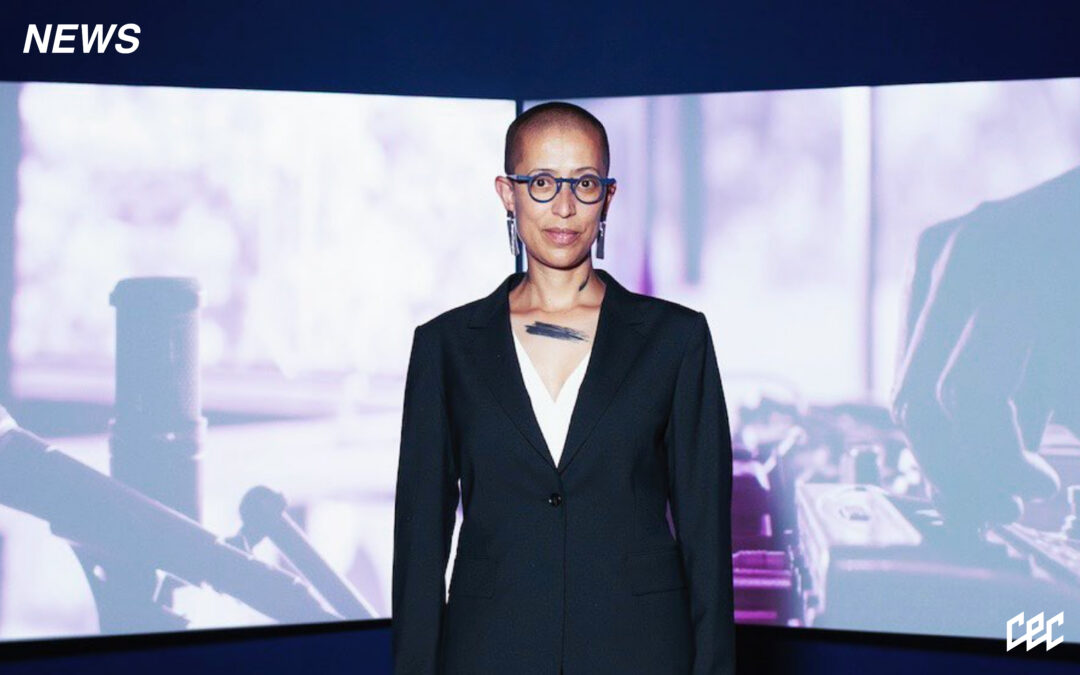
WGSN is the behemothic, leading destination for consumer trend analysis and forecasting on the planet – any design or fashion school worth their salt has a yearly subscription, alongside the leading brands, agencies, designers and product developers. With most of their prized information hidden behind paywalls, there has been a recent invitation by the company for the rest of us to peek beyond the curtain; this, I am sure, has to do with the hyper-participation we are beginning to see from consumers with the advent of online shopping, social media and investments into digital worldscapes in the hands of anyone with a smartphone. I know it doesn’t feel like it, but we really do have the power – and WGSN are able to collate what they perceive through their algorithmic-rich methodologies, and provide useful insight into the collective, aesthetic consciousness of humanity. What makes this quite compelling is that their work exists within a two year framework; projecting further enough into the future for the trends to manifest, while remaining close enough to the present moment for their forecasting to be actualized and relevant. Yes, we believe in timelessness regarding trends and consumption – but there is something quite beautiful about roaming their website and being able to paint an internal picture of what the world of design might look like in the next few seasons. Perhaps this is our innate need for certainty, or CEC’s total devotion to visual contentment.
The other half of this collaboration, Coloro, is a company created to build colour systems for the creative industries; combining research based in the logical application and intuitive envisioning of colour as it pertains to brands, communication and design. Perhaps the most fundamental experience we have as human beings is the interaction of our visual cortex with refracted light, and such colour is an immensely powerful tool. It is the subconscious compass with which we approach our lives – emotional, mentally, physically and even spiritually. In explaining their system, the Coloro website states; “Coloro is based on a 3D model where every colour is specified by a 7-digit code. This code represents a point where Hue, Lightness and Chroma intersect. The system is built by a 160-step Hue wheel with a vertical axis of 100 Lightness values and a radial range of 100 Chroma values. Together, they create a new model to define human colour perception for a potential 1.6 million colours. The only limit is your imagination.” Coloro offers products and services for educational and commercial purposes, so for a team as easily riled up by colour harmonics we are, we would go all in on whatever Coloro say for SS24 – those forecasted to already be emergent now, and reaching its apex in 2024 before the next cycle takes place.
Disclaimer before we continue: forecasts are fun demarcations of the future, they are not gospel nor should anyone live a cult-like accordance with whatever the powers that be say – remember, these colours can only be forecast because everyday folk like us have been spied on using people utilising intricate research, statistical analysis and technical wizardry that we may never truly comprehend.


Cyber Lime /// Coloro 051-76-36
The collaboration project states, “embodying the synthetic realism, Cyber Lime connects us to our ever-expanding digital lives. It is a punchy near neon that exerts and energises the body and mind. This hyper bright green signifies the powerful connection between nature and technology.” To us, Cyber Lime is a softer hue of Nike’s iconic Volt Green, and a welcome colour that holds connotation of futurist musings. We think its precursive presence is beautifully captured by @rustcakes‘s dragon field chocolate cake with vanilla cream cheese.


Radiant Red /// Coloro 011-50-32
Conceptualised as, “a sweet and playful summer hue with a delectable quality, Radiant Red confirms the importance of stimulating and emotionally engaging colours that morph effortlessly between the digital and physical realms. On a deeper level, this red connects to the care economy, a key society shift forecasted by WGSN. A greater emphasis will be placed on the giving and receiving of care as people and organisations recognise how crucial this is to our well-being, our communities and our economies.” We love the allusion of Radiant Red in @nogood__cakes toasted sugar, browned butter cake with grapefruit marmalade, passion fruit curd and rosewater buttercream.


Elemental Blue /// Coloro 117-47-13
This forecasted colour “confirms the continuation of mid-tone colours that speak of a slowed-down lifestyle and increased sensory awareness. This practical colour aligns to the pursuit of seeking the right balance of work, internet and possessions, representing a need for stability and moderation. Restrained and industrial in appearance, Elemental Blue can become surreal and experiential in a metaverse environment.” We noticed the foreshadowing of this serene hue in the Chandelier cake by @rustcakes, apt for wintertime; a decadent vanilla pistachio cake with coconut cream cheese.


Fondant Pink /// Coloro 147 -70 – 20
A perfect colour for joy and confectionery alike Fondant Pink “is a pigmented pastel with an easygoing, youthful appeal. It signals the return of the sweet, mellow shades of pink that blend effortlessly with lilac and lavender shades. This colour connects to feelings of delight, a sentiment that will become more important to consumers by 2024. Small moments of awe can act as an antidote to anxiety, enhancing well-being and slowing down our perception of time.” Teetering on the line between the pastel-ness of lavender and baby pink, this soft delight can best be noted in our colour swatches of choice – this vegan bergamot cake with passionfruit curd, lemongrass buttercream and coconut meringues by the @nogood__cakes.


Nutshell /// Coloro 024-37-20
The final colour Nutshell, “is a rich and spicy brown, transseasonal evoking warmth and reassurance. It’s inspired by the growing thrift and resale culture and consumers determined to rewrite the rules of entrepreneurship and fractional living. This colour speaks to sustainability over newness and a growing nostalgic sentiment that sees consumers return to retro-inspired styles and colours” is elucidated by a dark chocolate cake with a caramel, vanilla mousse by @rustcakes.