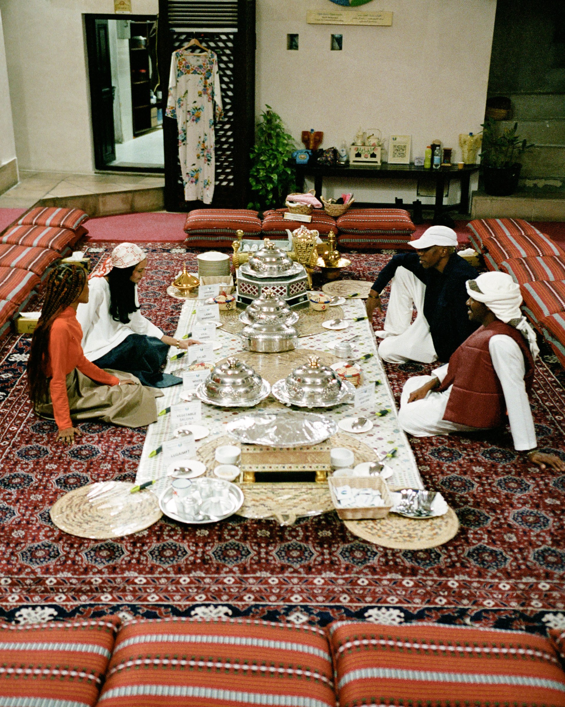
The 2023 LVMH Prize Winners
The LVMH Prize for Young Fashion Designers is an annual international fashion competition organized by the French luxury conglomerate LVMH Moët Hennessy Louis Vuitton. The prize was established in 2014 with the aim of recognizing and supporting emerging talents in the fashion industry, and is open to designers under the age of 40 who have presented at least two collections during their brand’s development. Designers and brands are reviewed by panel of renowned fashion experts, including designers, journalists, and industry professionals, evaluate the applications and select a group of finalists – some of the panelists in the past have been titans of fashion like Maria Grazia Chiuri, Marc Jacobs, Phoebe Philo, Virgil Abloh and Jonathan Anderson. Both of our South African alumni, Thebe Magugu and Lukhanyo Mdingi have seen their positions as finalists catapult their careers and cement their status internationally and locally; opening doors as bridges between our region and the global fashion industry. Winners receive generous grants, mentorship and recognition that support long-term viability for their labels.
It was announced yesterday that Setchu by Satoshi Kuwata is this year’s LVMH Prize winner. The label is a masterful fusion of traditional Japanese aesthetics and modern design, with an emphasis on quality materials and meticulous attention to detail, showcasing Kuwata’s harmonious blend of heritage and innovation through his travels and experiences.

Satoshi Kuwata

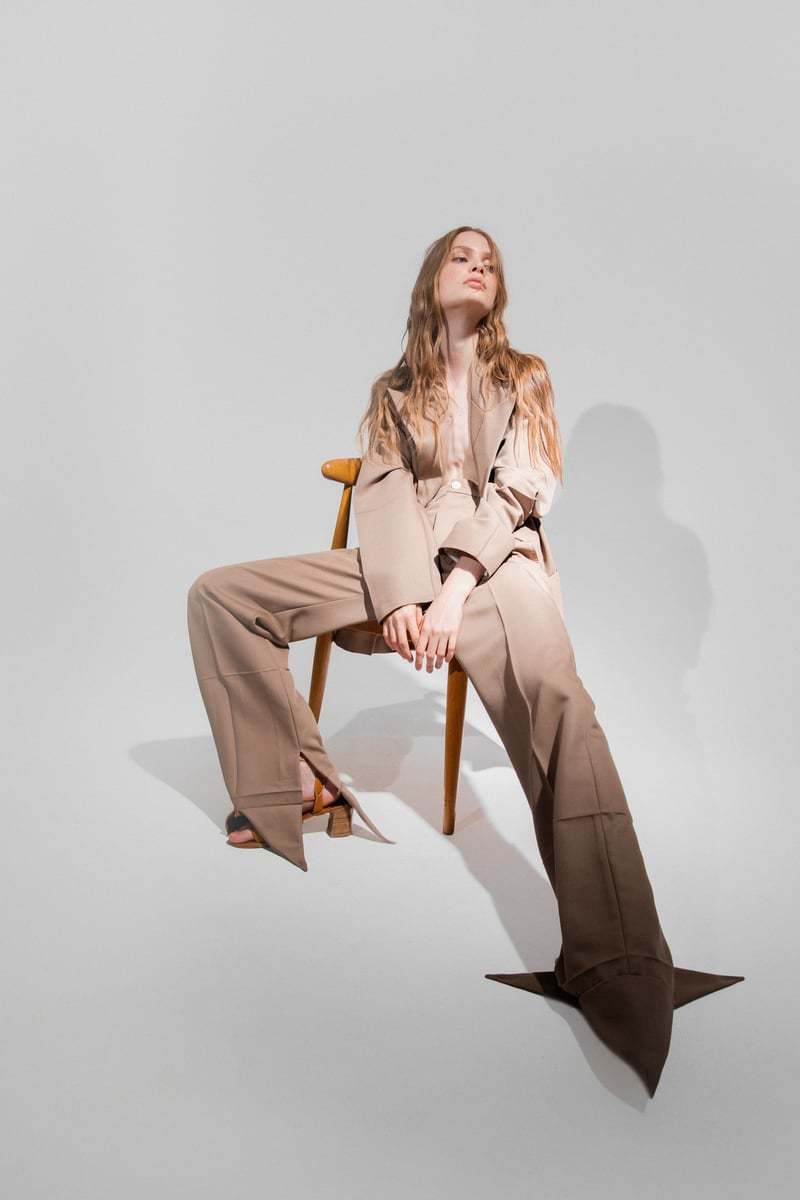
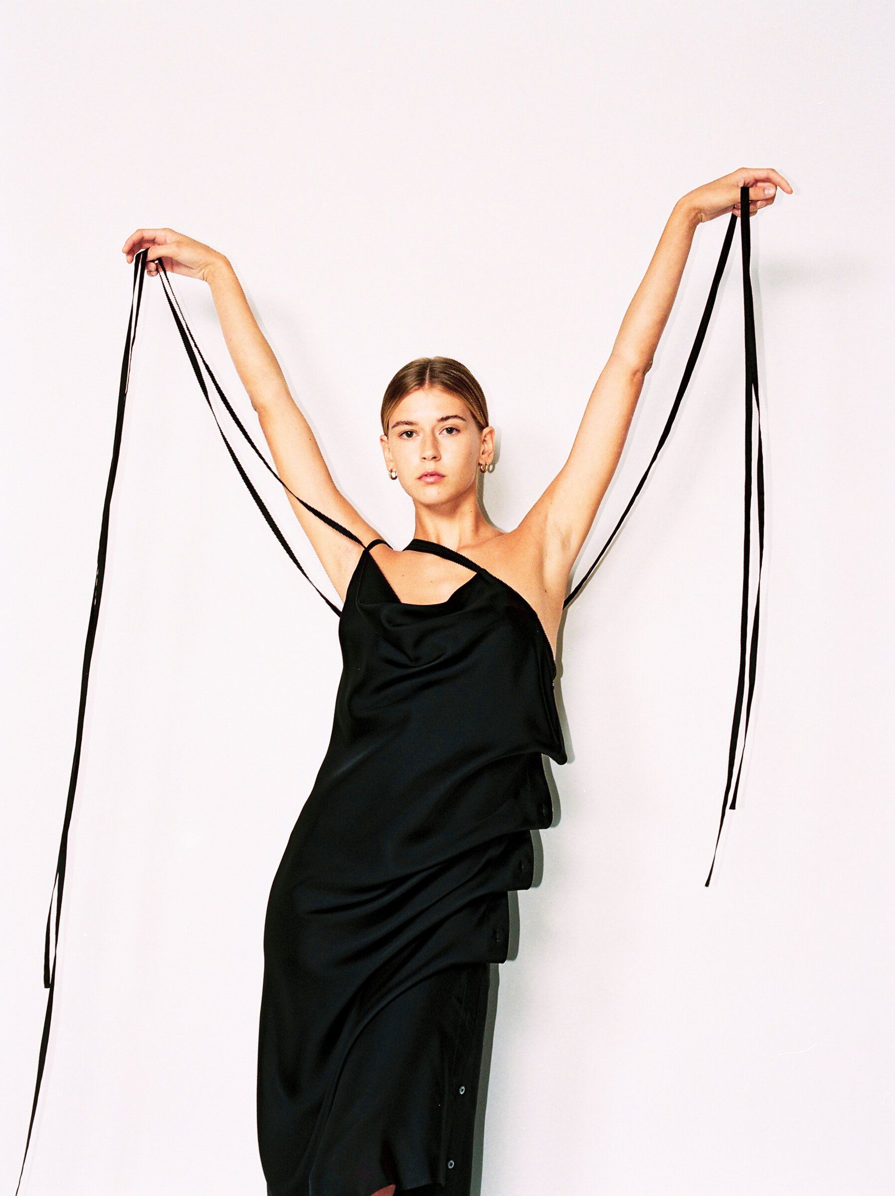
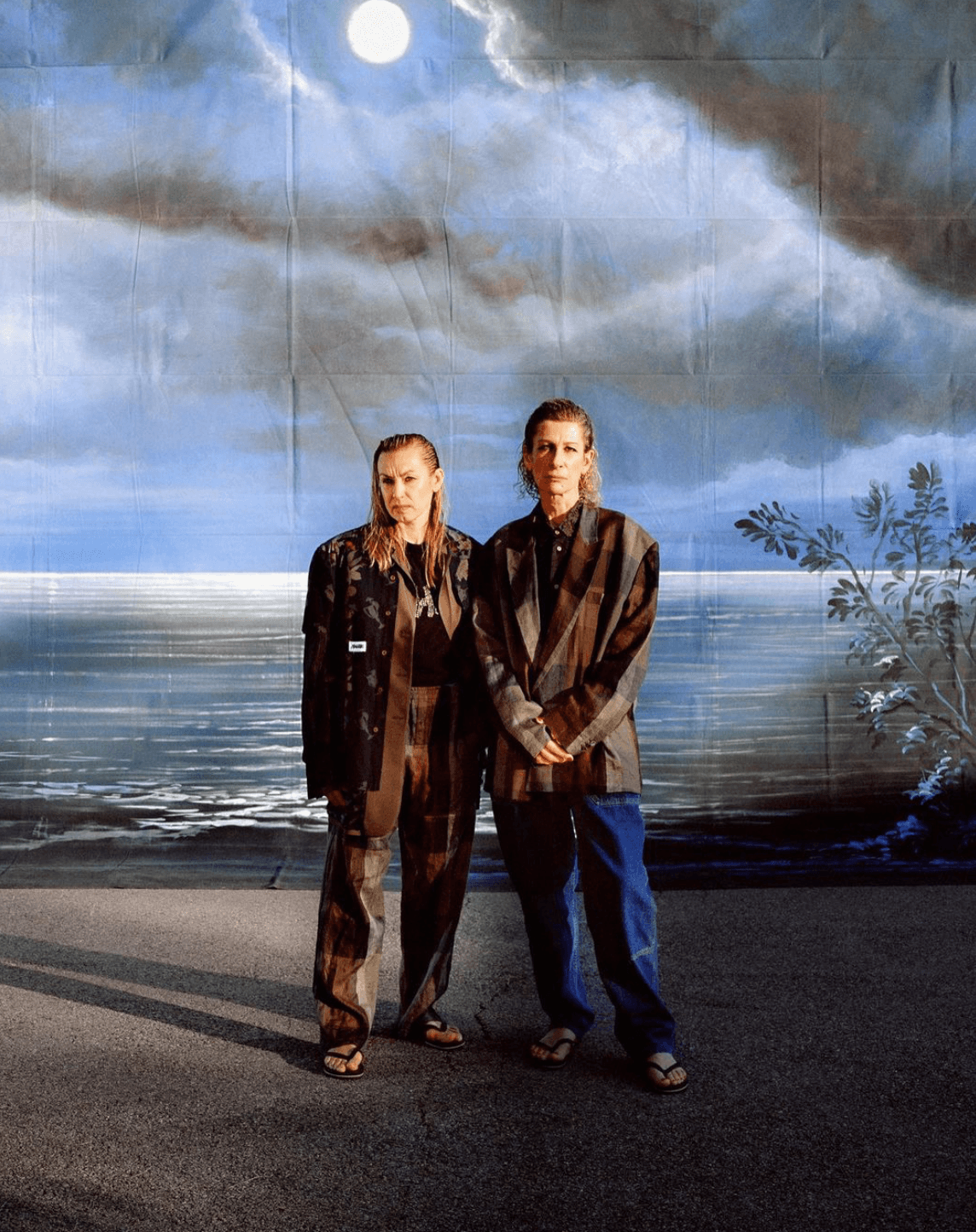
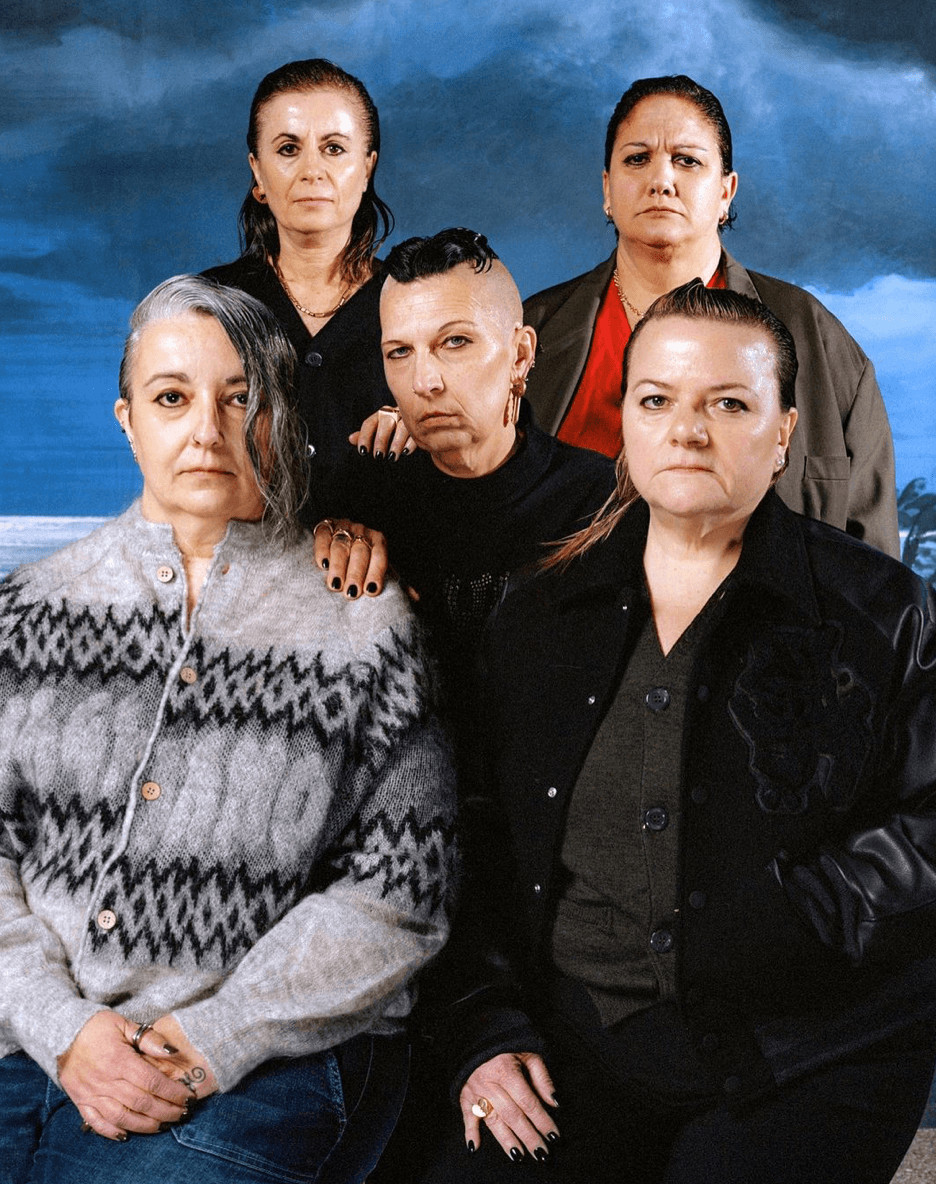
The first winner of the The Karl Lagerfeld Prize is Bettter by Julie Pelipas. Julie is already a prominent figure in the fashion industry, known for her influential work as a stylist and fashion director. She gained recognition as the former fashion director of Vogue Ukraine, where she played a significant role in shaping the magazine’s aesthetic and editorial direction; Bettter is Julie’s manifestation as a designer, with her powersuits embodying effortless and contemporary minimalism characterized by clean lines, silhouettes, and a restrained color palette. The brand’s epitaph ‘UPCYCLING SYSTEM’ is Julie’s answer to sustainability; fusing the power-suit with upcycling materiality and a new era of fashion production.

Julie Pelipas

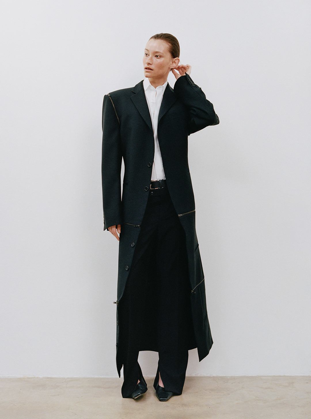
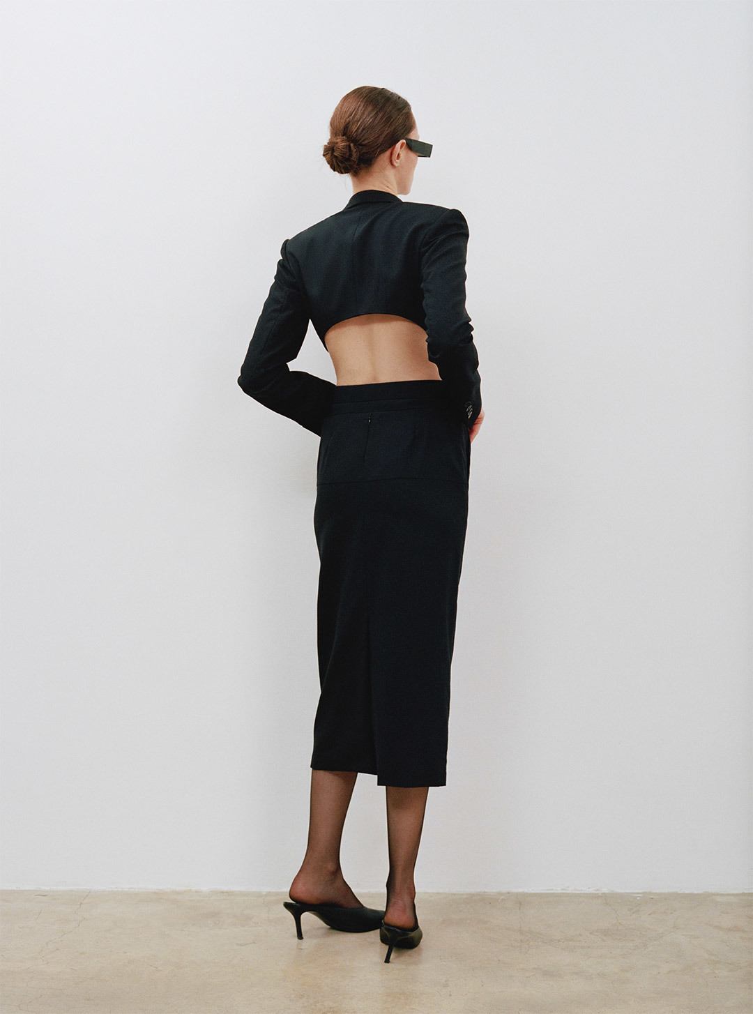
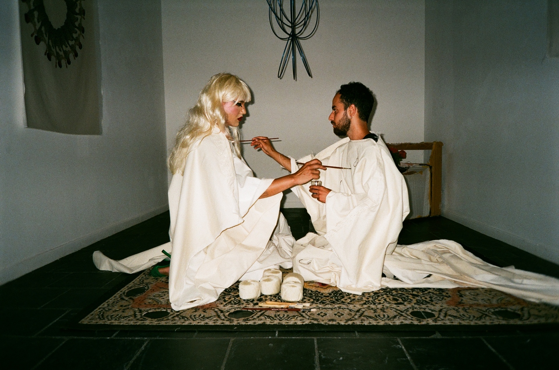
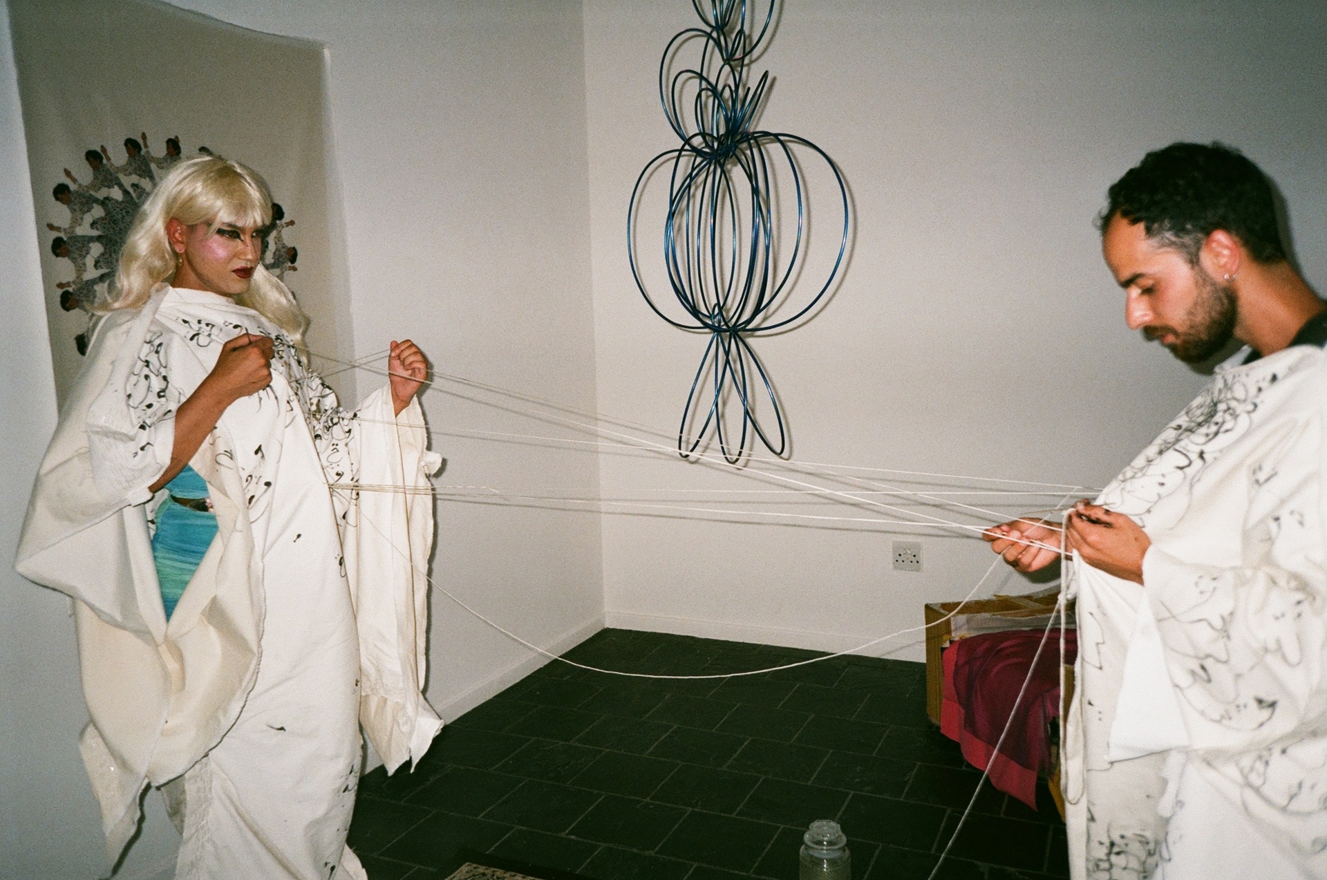
The third finalist, also for The Karl Lagerfeld Prize, is Magliano by Luca Magliano; with the vision of the brand Luca’s relegation of the traditions in Italian heritage tailoring and craftsmanship into a new, gritty era. His brand is a youthful, rebellious answer to the question of how much tradition should be preserved, and what could be reinterpreted; with his collection earlier this year featuring factory workers as his models, and a celebration of LGBTQIA+ expression amidst Italy’s growing conservatism and political oppression.

Luca Magliano

Credits
Garment images courtesy of brand websites
Designer images courtesy of LVMH
Written by: Holly Beaton
For more news, visit the Connect Everything Collective homepage www.ceconline.co.za


")


Recent Comments